Brookshire's Grocery Package Design
From Heritage to FRESH
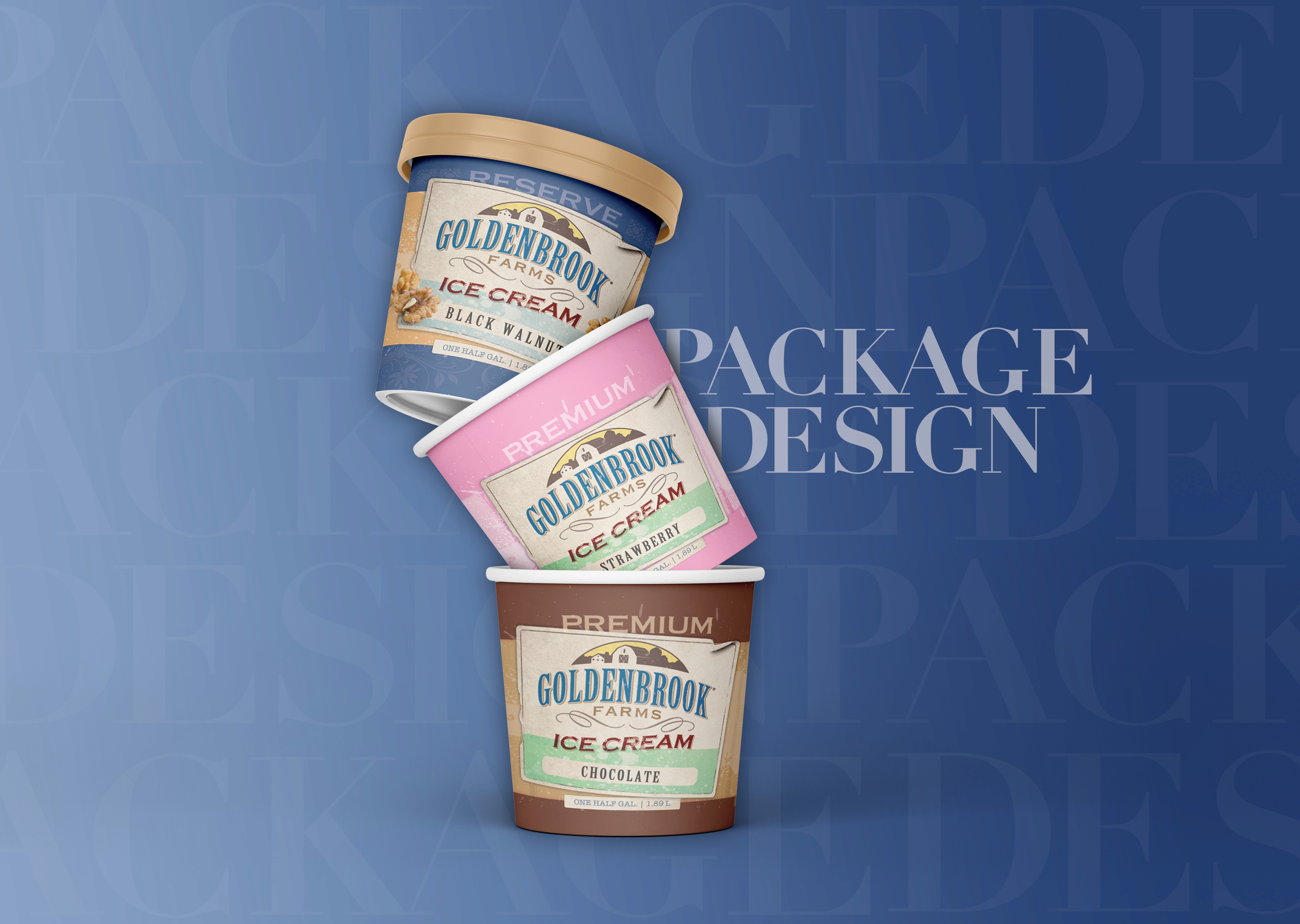
When Brookshire’s Grocery Company asked me to redesign the packaging for their store-brand ice cream, I leaned into the legacy. Founded in 1928, Brookshire’s has deep roots in the community—so I brought that story to the surface with distressed textures, rough brushstrokes, and classic typography. The result felt handcrafted and nostalgic—exactly what you'd want from a hometown favorite.
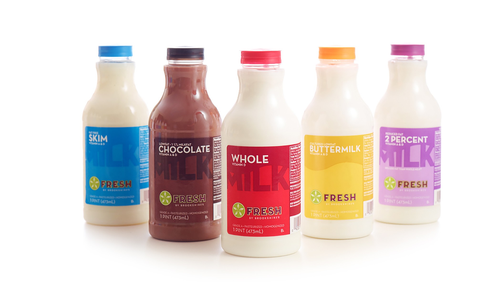
At the same time, Brookshire’s was launching FRESH, a modern, upscale concept store that needed a different kind of visual language. For this sleek environment, I designed clean, contemporary packaging for private-label milk and coffee—stripping away ornamentation and letting simplicity and clarity do the work. These designs went into full production for the store’s grand opening and have since expanded into other FRESH locations across Texas.
Two audiences, two aesthetics, one goal: make private label feel anything but generic.